
Today I want to show you what and what not to do when it comes to landing page design for SaaS (Software as a Service).
I’m going to use real landing page examples of sites running ads or doing some sort of paid advertising. This way you can see exactly how these businesses are burning money or what they’re doing right to get a great conversion rate.
Part 1. What NOT To Do in
Landing Page Design
Bad Example #1
So I’m going to jump right in and start with what not to do in landing page design. I won’t name the company that this page belongs to. Not to hurt any feelings, but this landing page is horrible.
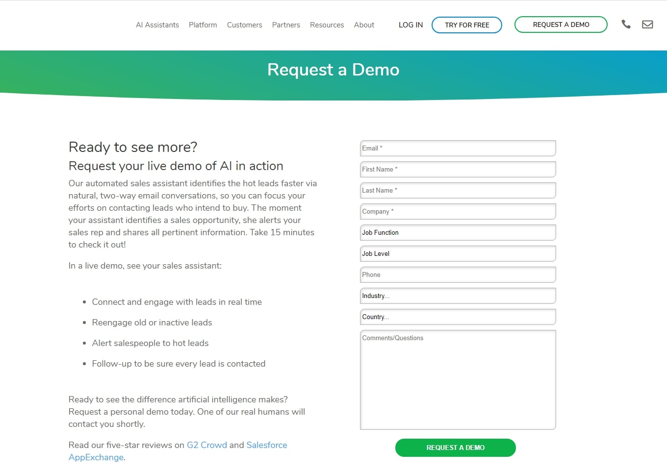
Mistake 1. Unclear Offer
Starting from the top – what am I requesting a demo for? Maybe I’m a branded search and I already know what you’re offering, but most people won’t. Assume that people won’t know.
Mistake 2. Unclear SaaS
Next, “Ready to see more?”, what am I going to see more of? There should be a video, some images, or a GIF showing me what the product actually is and what it’s capable of. I still don’t know what the offering is and this should be really clear.
Mistake 3. Starting the Form with High-Friction
Here’s a big red flag: the form is starting with a bunch of high-friction questions by asking for names and email addresses. This should be pushed to the bottom. Instead I would have the micro-commitments (such as getting their industry and job titles) pulled to the top.

People don’t hesitate to answer these non-personal questions as much as they do when asked for their name or email address. But after they’ve invested a short amount of time into answering a few simple questions, they’re more willing. This is simply bad practice.
I’d even go a step further with this landing page design and axe the whole form. If you’re going to be asking this much information, turn it into a multi-step form and ask for one piece of information at a time. What’s your industry? Next. What’s your job level? Next.
This approach will increase your conversion rate as opposed to saying, “Hey, here are 10 fields to fill in, enjoy!”.
Mistake 4. Displaying the Navigation Bar
Another adjustment I’d make is getting rid of the navigation from this landing page. Replace this bar with a CTA (Call-to-Action) and remove the menu. You don’t want to distract people.
Remember that you’re paying money to get them to come specifically to this page and get conversions. Then they’re being served with different opportunities to be distracted and bounce from the page.

If I was going to design this landing page I’d scrap this whole section because let’s be honest, nobody wants to read all of this. A very small group of people will sit down and start reading, “Our automated sales assistant identifies the…”, and even then there’s a high chance of them bouncing.
There needs to be some sort of engagement going on here. A video that catches their eye, GIFs that actually amuse them, anything that will make the page stand out and sell your service.
Mistake 5. Not Displaying Reviews on the Page

This one really bothers me. 5-star reviews are great, but why don’t you have them on this page? Why are you not getting me to trust you unless I leave the page?
It seems like an insignificant detail, but all these tiny mistakes contribute to a landing page being bad. Your business’s phone number shouldn’t be at the bottom of the page. Have it up in the top-left corner!
The same applies to the Request a Demo button, we want it further up the page and not at the bottom.
And to top it off, just get rid of the footer. It’s an unnecessary distraction and it makes the page look a lot more cluttered than it actually is. I’ll tell you what any other Google Ads agency will tell you: if you’re going to design a landing page like this then don’t bother wasting your time or money on it.
Bad Example #2
Again, I’m going to hide the company information since I’ll be ripping this landing page apart.
Mistake 1. Too Much Text
One way I judge a landing page is based on my very first impression. Most importantly what is the landing page for and does it pass the 5-second test?
This page is making me read all of these bullet points. Why am I being made to read all of this information instead of watch a video that would capture my attention before I bounce? Think about it from a potential customer’s perspective – they’re being asked to read a lot of stuff.
So right off the bat, this landing page just isn’t clear enough and has way too much text.
Mistake 2. Asking for Too Much Info
To continue from the previous point, not only do I have to read all these details, I’m being asked for a lot of information too. If you want me to fill in your lengthy form, give me a reason to give you that information.
This form should be multi-step. Just like the other landing page design I showed you, this one starts with the high-friction questions – name, email address, phone number – which discourages people from filling in the form.
Transform it into a multi-step form and rearrange the fields so that low-friction questions come first. This alone will help increase your conversion rate.
Part 2. What To ACTUALLY Do in Landing Page Design
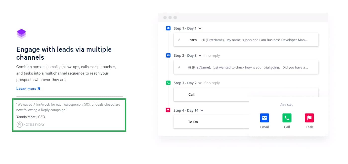
#1. Outstanding Landing Page Design (Reply)
I love this page completely, I really admire what Reply have done with their landing page. Here are some of the best practices that I noticed instantly.

Point 1. Clear Header/H1 Tag
Right away I notice the big H1 on the screen that tells me what’s going on. This is great.
One change that I would make is removing that navigation bar at the top. We want people to stay on the page, we don’t want there to be any distractions that make them leave. You design a landing page with the specific goal of converting people, and you’re paying for traffic to be directed to the page.

Controlling the experience by limiting where people can go and what they see on the page. Making them take a single action will maximize the conversion rate and you’ll ultimately be more successful in reaching your goals.
Point 2. There’s a Video!
I’d also probably add a little bit more detail about what Reply is. That said, it’s not necessary in this case because if we scroll down, there’s a video. Videos are an amazing element to add to a landing page design if you do it right.
Even better is that the video is automatically playing. Having a video is great but not everyone is going to click the play button if it’s their decision. But since this automatically starts playing they don’t have a choice.

In particular what I really like about this video is how it’s showcased. Features are shown in a way that make it clear how Reply can help you and in those first 5 crucial seconds, we’re left wanting to find out more about this solution.
And this is important – you’re going to be asking people for information so you need to give them a reason to stay on your page. Otherwise they’ll get to the form and think, “Why? Why would I enter my information?”.
Point 3. The Free Trial is Done RIGHT

Moving onto the actual field, they want me to give them my email address. Again, “Why would I give you this?”.
- 14-day trial
- No credit card required
- All features included
A perfect example of how free trials should be because if you’re making people fill in a form with their credit card details, or you heavily limit the trial version of your software, you’ll get a lot less conversions than you would with this approach.
These friction points are things people want to know. Is the trial actually free or do I have to pay? How long is the trial? Do I need to put my credit card in? Am I going to be limited with the trial or is it all-inclusive?
Put these points right below where you’re asking for information because as they’re reading the page, and once they see the email field, these things will pop into their head and they’ll want answers.
Point 4. Shows What Features There Are
Discover prospects on the go – another example of good landing page design practice. “Oh great, they’ve got a Chrome extension!”, and right there you can see the extension in action.

This is great especially when it comes to software. People want to know what your software is like. They don’t want to have to sit there, sign up, maybe download it, and then find out that the UI sucks or doesn’t have the features they want.
Give them an idea of what it looks like when they’re actually using the software and this will reduce the friction around downloading a new piece of software.
Point 5. If I Had to Add One Thing…
I’d maybe even consider adding a section explaining what they can’t do without Reply. Something like how much longer certain tasks take if you don’t use Reply or how difficult other software solutions are to use. Give people a reason to think “Maybe I really do need to consider getting myself this software”.
Of course you’ve already got plenty of pros of using Reply, but what about the cons if you DON’T use Reply?
Point 6. The Social Proof is Great
And then there’s the social proof on each feature, a really clever thing to do because having testimonials from somewhat well-known businesses will help a lot.

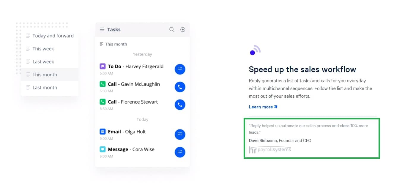
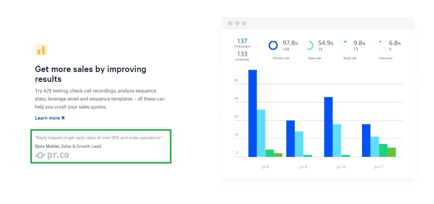
The only change I’d suggest is adding a face photo so that it’s clearer that this actually is a testimonial. As it is, I skimmed past that the first time without realizing what it was.
And then on these testimonials the actual numbers that client’s have been getting from using Reply are displayed. This is powerful because I’m able to see exactly the kind of experiences they’ve had and what results I’m likely to see if I use Reply as well.
#2. What to Actually Do (ConvertKit)

Next up is ConvertKit and on this landing page design there were a lot of good aspects I liked about it. However, there were a few things that didn’t sit right with me.
Point 1. The Hero Section is Good, But I’d Move It
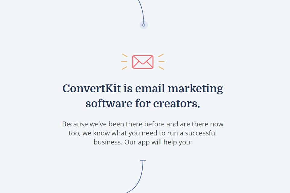
For ConvertKit, I was actually kind of confused at first. When I landed on their page the first thing I saw was the message to “Grow your email list and win $10,000”. I had to do some digging to find out that this is a challenge they’re running, but this shouldn’t he the hero section.
What I would do is switch the challenge with the section below which tells me more about ConvertKit – it’s an email marketing software for creators. This should be right at the top so that I know exactly what this software is.
Point 2. The Page Flows Well and is Visually Appealing
I really like the flow of this landing page design. Scrolling through the different sections tells me about the software, shows me mock-ups, and the arrows going from element to element keep me visually intrigued.
Then there are the testimonials. Not stacked all next to each other but the testimonials are sprinkled throughout the page. They have a picture of a person, their company name, and their genuine opinion of the software. This is a phenomenal landing page example of how testimonials should be presented.
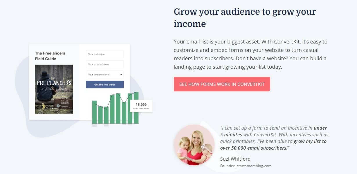


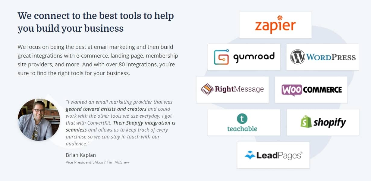
I’ve brought up having pictures next to testimonials already. This is because it stops me from just looking past them – a picture catches my attention and gives the testimonial more credibility.
Point 3. Another Page with a Video!
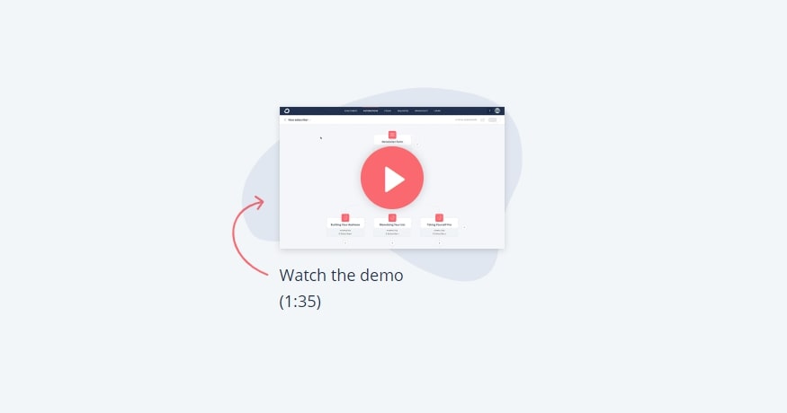
This part should be closer to the top of the page. As I’ve already said, have a video or a GIF showcasing your software – in this case they have both!
So I’d move this further up, left align the content, and right align the video (maybe even make the preview slightly bigger).
The point I’m trying to make is that this video is a great addition to the landing page design and by simply changing how it’s positioned, the page would convert so much more.
#3. What to Actually Do (Drift)
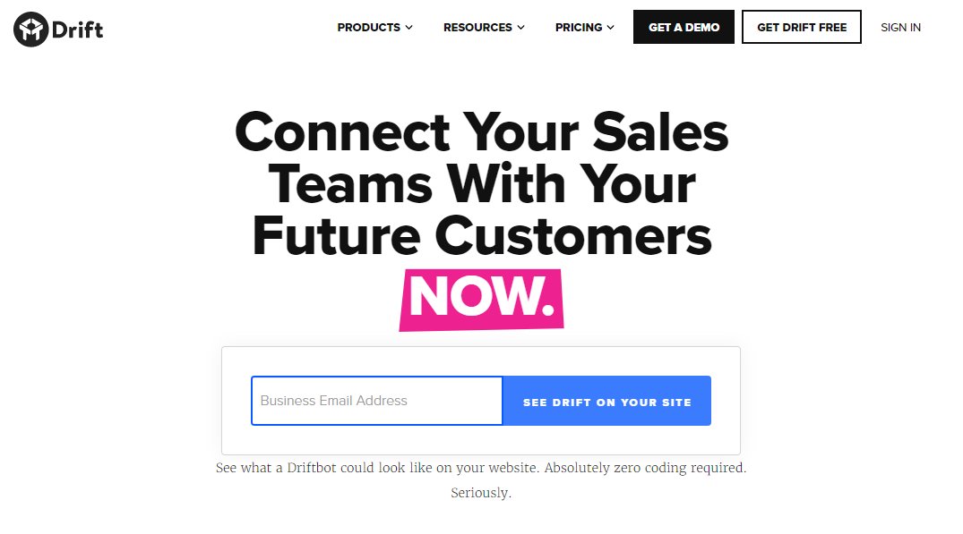
The final focus on my list of landing page design examples is from Drift, and they start with something I like to see in a design.
Point 1. Transitioning Header
First, the thing I find really cool is that their H1 tag shows how Drift can be used and transitions through this list of uses.

What I see on some software sites is people just listing a bunch of uses and matching them with some icons. That’s fine, but it’s really generic and you want a landing page to stand out. This cycles through different uses in a way that only a handful of other sites do and I feel engaged just reading these as they pop up.
Point 2. Clear and Low-Friction Sign-Up
Then we move onto the entry field. All I need to enter is my business email address? Great! It’s a simple non-intrusive piece of information that people don’t usually care about handing over.
And then there’s these buttons, and I really do love this part. You can sign up using an existing Google or Microsoft account. These are two websites that we’re all aware are safe, and having this option does two things.

First, it makes it easy for lazy people (like me) to quickly sign up. I just click this button, Google grabs the basic details from my account, and I’m signed up to Drift in seconds. I wish more SaaS businesses would take advantage of this idea. It’s been around for a while and it makes the sign up process effortless.
Second, it conveys a sense of trust. Google and Microsoft are trustworthy companies, so if I can sign up using one of my accounts with them, I get the sense that you’re trustworthy too. This is a small detail in landing page design that has a big impact.
Point 3. Free eBook is Showcased
Down here they’ve got the “Modern Marketer’s Playbook” which is obviously a lower friction offer. If I’m not convinced to sign up for Drift just yet, I want to see some of the features and how it could benefit me.
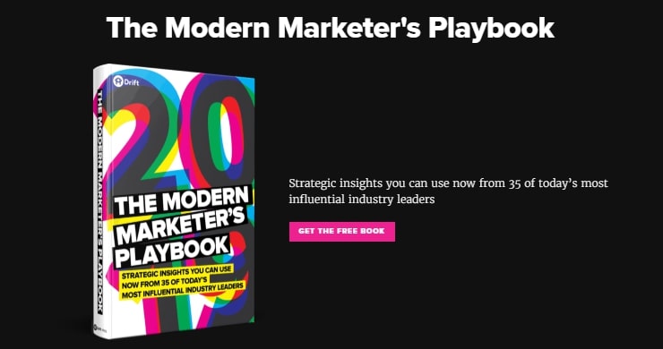
So, move the playbook section up and put Julie further down the page. I might not want to sign up but I’d still like to find out more, and maybe that book is what’s going to convert me.
Having the element below is also great, I definitely suggest adding something similar to your page.
Point 4. The Software is Shown Live in Action
This is pretty unique, but it’s not a luxury everyone has. Driftbot, one of their products, is actively used on their site and it’s a great way of showing the product live in action. If you’ve got a service that can be shown in practice, find a creative way to show people like this does.

In addition there are screenshots of the bot being used. Just like ConvertKit, this is showing me the actual user interface. I don’t need to download and set anything up just to see what it looks like, the landing page design shows me. Let’s face it: we’re visual creatures and if software doesn’t look good, regardless of how impressive the features are, we’ll barely consider using it.

By showing people the product before they sign up for anything, you’re giving them less to do and this reduces the risk of them bouncing.
And then we get to the bottom of this page and there’s a second CTA so that anyone who didn’t enter their email address before will have a second chance to become a customer.
Get the Landing Page Design Right
Hopefully these breakdowns gave you some value. Now that you’ve seen real examples of the good and bad practices for SaaS landing page design, you can pinpoint where you’ve been going wrong and what you’ve done right.
Designing these pages to improve your SaaS PPC strategy isn’t a quick nor easy process. But with these examples in mind you can put yourself in the best position to boost conversions.
On the other hand, maybe this all seemed too overwhelming and you’d prefer to have a professional take it over for you. No problem! At KonvertLab we handle landing pages daily and if you book a call, we’ll walk you through how we can help your business.